.jpg)
I’ve talked about this in the past (and in-depth in my Icelandic Poppies Online course) - to create depth and interest, I always work with an underlying colour and then layer colour on top. Just like painting on canvas, I like to set the undertones first. I usually prefer a white undertone: it creates easy to achieve highlights and it tends to brighten the colour that goes on top. For green leaves, I like to use a green under colour that leans into either the coolness (blue) or warmness (green) of the final green colour I want to create. So for example, for eucalyptus greens which favour a blue-green type of green, I might use a neutral green (like out of a tube) or a very blue green, and then layer on top, a green of a different temperature to create the blue-green I want.
DISCLOSURE — When you click on my affiliate links, I may earn a commission for qualifying purchases made through Amazon.com links in this post. This commission goes directly into the maintenance of my website, the technology that goes into my courses, and my art. Want to know more? Read my AMAZON AFFILIATE DISCLAIMER.
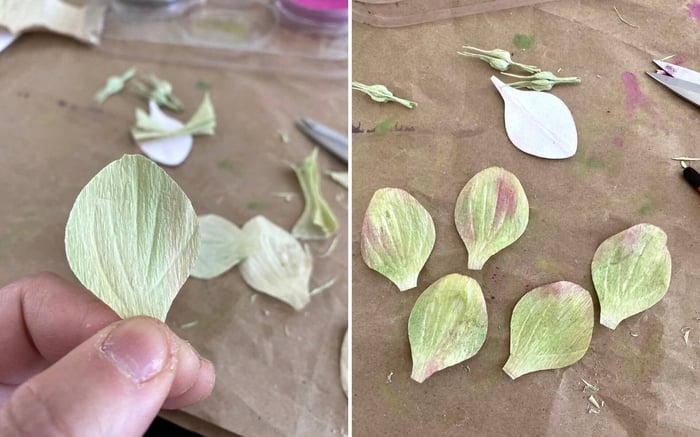 Left: Hellebore petal with under layer colours. This paper was painted first, then laminated, then cut and shaped into form. Right: Hellebore petals with Pan Pastel colouring on top of the under layer.
The lovely thing about tea is that you can easily control the lightness/darkness of the tint by simply controlling the amount of water you add and the type of tea to use. I use black tea for stronger colouring and oolong tea for more subtle colouring. I make the tea and adjust how strong (dark) the tea is with water. Then I mix my acrylics in a separate small plastic container. I don’t have use too much acrylic at this time. I usually use acrylic that goes in a tube, but liquid acrylic works too (more on that later). Once I’m happy with the colour, I pour a bit of the tea-water mixture to it. Then I mix and test for colour intensity. If I want a darker value, I add more colour. If I want a lighter value, I add more tea-water. That’s it!
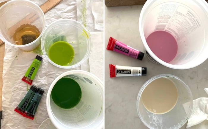 Left: Containers holding a tea-water mixture, and tea-water mixed greens. Right: Containers holding tea-water mixed pink and white.
This technique works the best when you want to create soft colours - perfect for painting the under layer colour. If you want more intensity - a darker purple for example - use liquid watercolour or liquid acrylic. You can also try using professional-level acrylic paint which has more colour pigment and less filler.
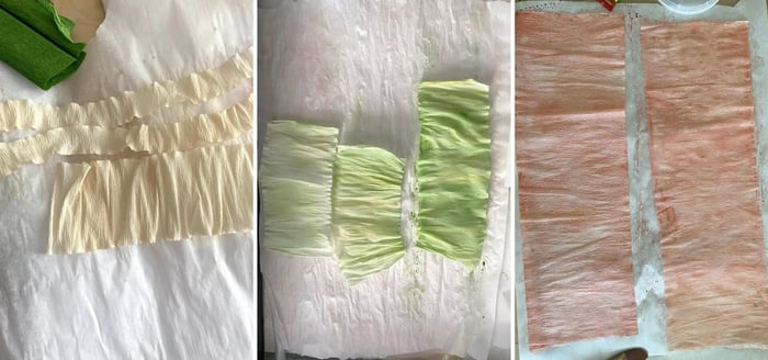
From left: Crepe paper painted with oolong tea/water; painted with black tea/water + green acrylic paint mixture; painted with black tea/water + pink acrylic paint mixture.
The same philosophy works in the cake-baking world with buttercream. Carol Ravagnani has a really great demonstration of how tinting a base medium works using buttercream and using only two colours - yellow and purple - to achieve a harmonious colour palette. Although this video is to promote her new colour course, she shares invaluable insight into how she creates her unique colour palettes for her cakes.
There is, however, a main disadvantage of using water or tea-water as a base medium as opposed to an acrylic medium, and that is the water breaks down the polymer binding between the colour pigments in the acrylic paint. It therefore destabilizes any lightfastness of the paint and is no longer water resistant. It continues to fix itself on the paper without bleeding.
Despite these disadvantages, I find this process an effective way for me to achieve the colouring and effects I’m looking for. While it’s not for everyone, I hope it gives you some ideas.
Be sure to check out my Hellebore Online Course where I share how I use this technique step-by-step in video demonstrations, along with my colour recipes to achieve the muted greens and purples of a true hellebore (and double hellebores!).
Want to learn how to make realistic looking paper flowers?
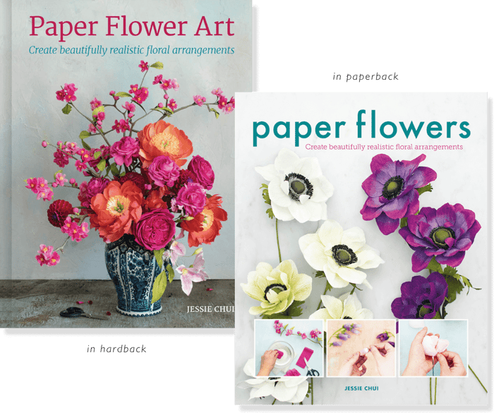
I share how I make realistic paper flowers and how to arrange them in my book, Paper Flower Art (GMC, 2019) (buy in hardcover or in paperback), or within my Online Courses.