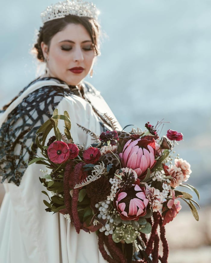

It’s not often that a bride wants a black bridal bouquet, so when my client approached me for one, it immediately piqued my interest. Her overall theme was black - her wedding dress, the groom’s suit, and the bridesmaids dresses were all going to be black. So it was up to me to convince her that a literal interpretation of a black bridal bouquet would be, well too literal. For one, truly black flowers don’t exist; for another, paper flowers aren't real so I personally feel that using black paper for paper flowers just reminds people that paper flowers aren’t real; a third reason is that black flowers against a black wedding dress just wouldn’t stand out. Luckily, my client trusted me completely. So after getting to know her personality and after some discussion of her vision for her wedding, I was confident that I knew what she would like.

Paper proteas, carnations, roses, wax flowers, hellebores, ranunculus, scabiosa, and dried lotus seed pods
DISCLOSURE — When you click on my affiliate links, I may earn a commission for qualifying purchases made through Amazon.com links in this post. This commission goes directly into the maintenance of my website, the technology that goes into my courses, and my art. Want to know more? Read my AMAZON AFFILIATE DISCLAIMER.
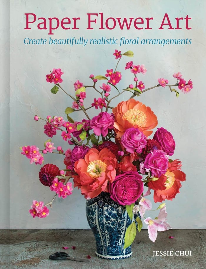
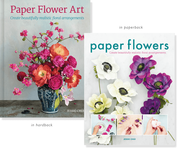
This black bridal bouquet was assembled in a vase - so it can easily be displayed at the wedding or at home as an arrangement/bouquet. I usually prefer assembling my bouquets in some sort of vessel with a narrow mouth (I describe my process in my book, Paper Flower Art). However this time, I used a fancy vase and the bouquet became a stunning arrangement.
My approach to making a black bridal bouquet is to create a sense of darkness and the dramatic, without it being truly black and without a ton of dark flowers. Dark flowers placed next to each other blend together too easily - their details are difficult to see by your eyes and by the camera’s lenses. A trick that Impressionist artists use is to place two colours that sit opposite in the colour wheel next to each other; this contrast creates and/or emphasizes the vividness of each colour. Likewise, when you place a darker colour beside a lighter one, this contrast emphasizes how dark the burgundy is and how light the pink is. That’s why I tried to mix the dark and light coloured elements throughout the arrangement; however, because the colours lie within a similar colour spectrum - that is pinks and burgundies - you notice more of the contrast in shades (highlights/shadows) as opposed to contrast in colour.
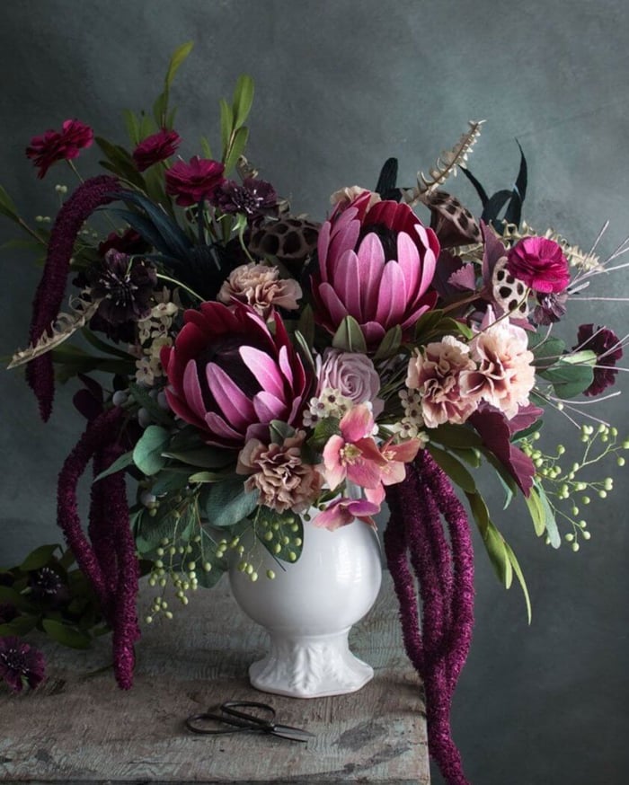 Black paper flower bouquet in a vase
I’ve always been enamoured by how florists use amaranthus to draw your eyes downwards. So I was thrilled when I finally tried my hand at making paper amaranthus and succeeded. When grouped together, they suggest a sense of visual weight like no other type of flower. I can imagine them swinging about as my bride walks down the aisle.
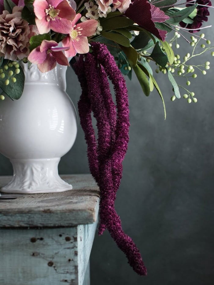 Paper amaranthusI’ve made scabiosas before but this time, I decided to make bigger ones. I simply reused the centre technique I use for my Collerette Dahlias (from my book) in a different colour. I make my scabiosas with fairly long petals. They're not proportionate to the real thing but I like them more this way. It’s like they are wearing tutus.
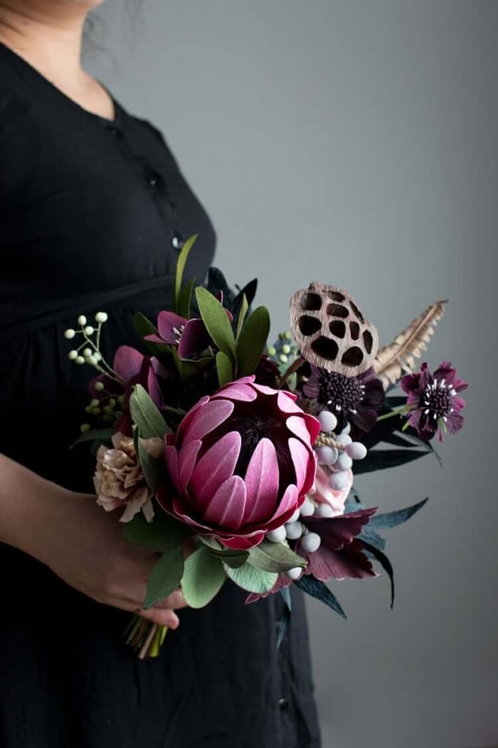 Black bridal bouquet for the bridesmaids
The last piece of the pie was the antique carnation in mauve and sepia. I used 180 g Italian crepe paper in Dusky Plum and simply bleached one long edge (this technique is in my book) before cutting out petals. Deceptively easy to achieve this colour variegation with stunning results. This flower provided the perfect mid-tone colour to tie the pinks together with the brown dried elements.
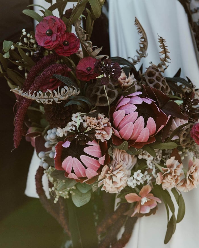 Photo: Dawn Sparks
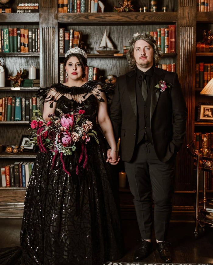 Photo: Dawn SparksThe very last thing I did was wrap a black velvet ribbon around each black bridal bouquet letting the ends hang long a bit. I thought it would be the perfect textural contrast to the paper flowers and my client’s sequin wedding dress.
 What do you think? I loved how this turned out and how it really pushed my creativity.
 Want to learn how to make realistic looking paper flowers?
My book is out! Learn how to create realistic blooms and arrangements in my book, Paper Flower Art (GMC, 2019) (buy in hardcover or in paperback). Check out my Online Courses with video demonstrations and closed captioning for more in-depth learning at your own pace.